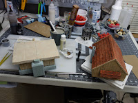
The roof is made of medium weight chipboard which is way easier to cut and glue together and both more rigid and more thin than the more typical Readi-Board I usually use. Down side: its thinness means that the front fascia has less to hold onto which made gluing them down harder. Overall, I think there's good and bad with these amendments and while I'm glad I experimented some, I don't think this will be my preferred method for future buildings.Just like last week, the top floor is held with magnets while the ground floor is held by friction fit like my other buildings. Also just like last week, we start paintage with Mod Podge plus black craft paint. For this paint job I didn't want the planking to be super duper dark unlike the inspiration photo I worked from. I started with a fairly light brown drybrushed with an off white. After that I hit it with a couple layers of wash with the terrible brown craft paint wash I made years ago + Liquitex Raw Umber ink and the same terrible wash + Daler Rowney Red Earth Ink for the roof and top floor. Every time I use it, I'm struck by how wood like the raw umber ink is over a brown + light highlight.
Probably this building wanted to be darker. The inspiration picture was much darker, anyway. I don't think the roof is quite as nice as last week's and the wood seems newer and is lower contrast than I think it should be. I like the re-addition of the chimney (notably missing from many of my buildings) and despite wanting tighter shingles, they ended up the same size I usually make them. So there's that.
The bottom windows and door are glued into the walls without transparency. There's a piece of yellow post-it behind the granny grating to pseudo-stand-in for a lit interior. In retrospect, I should have painted them instead. The top floor's windows are cut out but with the same granny-grating and post-it construction. The intent was to have translucent window pains to show a dollar store tea light through. Well, it turns out that under normal lighting conditions, the tea light isn't strong enough to show through. That's how we learn--by tryin' stuff. I might redo the windows on this building sometime in the future. Watch this space!
2021 finished building counter: 3/5


No comments:
Post a Comment