2024/12/20

The Banner Saga

Ages ago, in the heady days of April of 2012, I kickstarted a game that I thought had a lot of promise. I gave them a bunch more money again in March of 2017. The Banner Saga lived in my "to play" queue for a decade and change and, well, recently I decided that not only did I have the time, but I had the inclination to play it and its sequels. I probably shouldn't have waited.

I've talkedtyped a lot about the kinds of games I'd lie to see, particularly ones that have good writing, striking art, and elements of humor. The Banner Saga has all three plus excellent music and well-realized mature themes. There's good and bad in it, just like all games I suppose, but it all comes together in a way that not a lot of games do. There are some significant spoilers in her for games released between 2014 and 2018 so if you don't want those, you might look away. I'm also going to break it down as I am normally accustomed to doing and, because words are hard, I'm not going to spend a bunch of them explaining game mechanics thoroughly.

A Brief Overview

The Banner Saga is a story driven narrative following a series of characters trying to save their friends/family/world from one or more untimely demise(s). A turn based tactical combat underpins the narrative and every decision makes a difference, though some are gravely more important than others. There are a couple dozen or so named characters, mainly your heroes, and the point of view character bounces around between bands of folks doing things in different parts of the world. The themes are Old Norse, which, if you know me (and if you don't I have no idea how you found your way here) you know that this is right up my alley. Little did I know in 2012 that I'd spend significant time learning the language in the ensuing years.
 
The basics of the tactical game aren't particularly deep but they have some nuance, especially in the second and third installments. Movement is somewhat complex given that some of your characters take up four squares and easily get blocked by your other characters if you don't plan it out carefully. There's also a round-robin "I go, you go" turn timer that has some interesting consequences. If you blitzed down the cannon fodder too fast and didn't wear down the scary bad, you'll be terrified to know that the scary bad moves *way* more often than you'd like. Armor is a flat value off of damage, but strength is your hitpoints and the base amount of damage you do on a normal hit. If you've taken damage, you can easily get in a place where a normal attack vs. strength wouldn't move the needle much if at all, but you can also attack armor which knocks off a chunk. Characters also have a willpower microcurrency that allows you to boost your attacks and power special moves and whatnot adding another layer.

Time outside of the tactics game is split between narrative and caravan modes with the former handling a lot of the heavy dialog, especially between more than two characters, and the latter being where you see chibis of your heroes, clansmen, and the giant varl that make up your caravan. Hiking to the next town (no horses, says lore) costs supplies and morale a la The Oregon Trail and you hit some pseudo-randomized events on the way. These adjust morale, supplies, the folks in your caravan, and can set up events for the future and perma-kill characters as well. Can you tell when a character is going to perma die? Often not, but we're not there yet. All three games, should you import your games from the previous, build into a whole with many events harkening back to previous choices often in previous games to determine how it all works out. Often this is big stuff like "does the world end or not" and "does Egil die in a terrible way." Is it always obvious which choices you're making? No, but we're still not there yet.

The Good

The game is strikingly beautiful, in the style of western hand-drawn animation. I wanted to saytype "cell-shaded" but that's a rendering trick to make 3d content look like hand-drawn animation. The characters are distinct and well realized from the different color choices on Alette's or Nid's clothes to the distinct horns on every Varl. There's a small number of animation frames for each during their dialog scenes so it isn't just a flat image with text below it and the camera bounces around between speakers which is a nice touch. The landscapes and battlegrounds are very nicely drawn and help to sell the (presumably) iron-age Viking-era setting replete with godstones, runes, and stonework. 

Austin Wintory's soundtrack is also a work of great beauty. The mix of modern and traditional instruments and vocal elements gave it all an authenticity that I greatly appreciated. I never found a situation where the music didn't match or didn't help sell the emotional beats of what was happening in the game. I'll also add that there were points during some hectic battles where the music changed to match my angst. I don't know if that's due to a dynamic music system or not but it was hella rad when it happened and it happened multiple times over my not-quite-40-hour playthrough. 

Bad things happen to good people and occasionally, good things happen to bad people. I dislike seeing beloved characters killed off arbitrarily (more on that later) and it's real easy to get attached to these characters. These events come early and often and many of the ones that survive bear the marks of their choices and/or fortune in inescapable ways. One of the PoV characters loses their freakin' arm in one fight and their eye in another. Dude survived in my games, tho. As loss is a major theme in the game in its particular dark and gritty way, I ultimately added this point in the good section though I struggled a lot with where to put it. This is ultimately what kept me from enjoying Darkest Dungeon which I wrote about way back in 2018 in review.  The themes of loss and struggle rather remind me of The Black Company which is worth a read if you haven't already.

Characters often say little but tell a big story. Decades of GMing have taught me that words are cheap and that actions are preferable when you can swing it. A surprising number of characters have well-realized arcs, many of them shaped by your decisions in game. One of the stronger examples I can give is the archer Nid, (one of my favorites) an otherwise un-noticed mother of three, only adds to the roster in the first game if you win a particular fight and had opted to have one of your heroes train peasant women as archers two chapters earlier. You also have to talk her out of leaving the group after an off-screen event in the third game by telling this battle-hardened, would-be normal mother that you know she's no coward further reinforcing the dialog and actions she had previously. The game is full of this kind of writing which so often goes overlooked.

Beyond the characters, the overall storytelling is on point. The Banner Saga spins a vast tale of love, loss, betrayal, and a harsh and uncaring world. We get hints about the bonds between Juno and Eyvind basically from the first time they're on screen and in the last game we get trickles of how messed up things are and the direct hand they had in it. Depending on the choices you've made, it all might end in the destruction of the world. Scrutinizing some seemingly throw-away dialog, I might also conclude that by Eyvind breaking the world to save Juno, that he stumbled upon a ticking time-bomb intended to destroy the world, and inadvertently conjured up (pun intended) an opportunity to ultimately save it. He even telegraphs this cryptically in the first installment IIRC. This is an impressive feat over a multi-year set of projects and one that I think probably deserves more attention.

The Bad

No game is perfect and I certainly had my gripes about The Banner Saga. 

The game has no player-controlled save system. The game automagically handles saving which sounds good on paperin a blog post but I don't think it worked out in the game all that well. Every time I went to a previous load I had to wonder how far back it was going to take me and if I had to do that last gruelling fight over again. Over time I figured out how it worked more or less, but there were still surprises. The autosave system was made a lot worse in the last installment which, for whatever reason, as super unstable. I started the game five times and it crashed or hit me with an infinite load screen three times. Not a good average. 

I also had quibbles with some of the interface design, though notably I play on a super duper wide monitor which puts active elements far out of my normal FoV. Also of note, I have questionable eyesight and very old, very scratched glasses which are becoming worse and worse. In the tactical game, I often misread who was moving. This sometimes caused me to make moves that didn't make a lot of sense. This wasn't helped by the "commit move" interaction being easy (for me) to accidentally hit. I also ran into many instances where the threat was hidden because the ever-important armor/strength values are only available on-hover and your guys generally show on the bottom left, far outside my attention. More than once I ended up making an attack that didn't do what I expected and it's not like I was heavily drinking (nb: I mostly quit this year). As a last note, even after 40ish hours of game, I still don't know how varl move along their path. In the first couple games it was annoying if I couldn't path around other characters unexpectedly but in the last game where there were on-map terrain hazards, this was super annoying. I don't think any of these are game-breaking but overall it brought down my enjoyment of the game.

The game has two major currencies that aren't people, particularly renown and supplies. Supplies are consumed moving place to place and sometimes bartered at decision points. Renown is used to buy level ups for your characters, magic items at shops, and supplies, sometimes for very bad exchange rates. If you don't have enough supplies, bad things happen and the game has multiple events that super rob you of the supplies you have so there's always a crunch on them. Renown being used for so many things and mostly being rewarded for difficult decisions and winning fights is super tight. You generally can't level all your characters up and it makes it hit even harder when you've spent a bunch of renown ranking someone up and then they run off or die terribly. Much like an earlier note, I struggled on which area to stick this in because I'm pretty sure that the scarcity of resources is intentional. The game is gritty and this is one of the ways it's sold, but it still stinks knowing that your named characters could be so much better except that you have to keep spending your renown on supplies so your people don't starve. I get it but don't like it

The last note I'm going to make in this section is the hardest. When you make decisions outside of combat, the consequences are often terrible and often seem arbitrary. Egil dies in one of the first scenes in the first game depending on your decision which would deprive you of some excellent writing and an excellent character for the rest of the series. I get that this helps replayability but having looked through a lot of the different paths of those decision points, you can lose out on a lot of how the game eventually plays. Didn't save the Dredge baby in the first game? Your PoV character (Rook or Alette) probably dies in the third after watching the other main PoV character die in the first. Didn't take Eyvind down the right set of logical paths at the end of the game? Get ready for some of the darkest endings for the series. I don't like this and I get that it's entirely intentional. It's easy to get locked into "lol, nothing matters" when you see decisions go way off the rails too often and this is not what you want in a narrative heavy game. This is my biggest gripe with the game and it led me to scrubbing through walkthroughs and saves regularly which didn't make me like the game more.

Final Thoughts

The ending of the first game is abrupt and sorrowful and maybe it's because I've been processing a deep personal loss this year, but it hit me particularly hard. You've spent a lot of time with these people by then, deciding on their trials and tribulations and it's hard not to care about them. At the end of the first game, one of your last decisions will tragically kill one or the other of the main PoV characters with a gut-wrenching funeral scene at the end. The middle installment doesn't pull the heartstrings quite so hard, but the last one ramps it up with a vengeance. I got the "good" ending which I fear is not the canonical ending since the next-less-good ending has more writing and a voice-over scene with two of the now-deceased PoV characters. The other four endings were bleak--very bleak--and while I'm glad I watched them all, it was a real downer and I don't honestly know if I'd feel as strongly about the series as I do had I gotten one of those other endings. As John of  The Writer's Block writes quite often: the ending is all that matters. I think this is especially true of works as emotionally charged as The Banner Saga, especially when you factor in that most players won't finish a game and an even smaller number will complete it again.

The game is dark and gritty and portrays a world where hope is fleeting and far away where it exists at all. What carries these people through to whichever ending you might get to, is their love for each other and their determination to survive. I've asked the question here before: can games be art? If art makes you feel something, then The Banner Saga is most definitely art. Despite its shortcomings, I loved the series and encourage everyone to play it. This is the kind of game that I want to see more of from the industry. It stands as a testament to what the medium can be.

2024/12/15

Propapalooza week 19 (2024 week 50)

Finally we have reached the end of the major push for D&L props. There's a handful left that were missing pieces (because I lost them), were so unuseful that I couldn't be bothered (so I didn't paint them) and/or I'm saving them for some nefarious purpose. Also, I really, really needed to be done with them. Anyway.

First up we have a set of stone bridges. I think the two small ones and the two larger ones are from different Dungeons and Lasers kickstarters and since I had so many of them, I painted them differently. The two foreground ones are painted as normal with some additional effort toward weathering which I think worked out pretty well. The ones in back are heavily darkened because they're supposed to be in night time. I don't think that sold as well. I didn't do any OSL on the night time ones though that was my first thought because it's super inefficient to light bridges that way and I just couldn't see that being a real thing.

Next up we have four sci-fi busted up corners. These fit on top of their normal tiles which is nice but they didn't have any convenient ways for me to magnetize them which is not. I basecoated them in metallic through the airbrush which sped things up quite a lot. I spent extra time picking out details and darkening them down with various washes. I think they look OK but I doubt they're going to get much screen time because while they do match the Dungeons and Lasers tiles, they don't match my hand-made magnetized foam tiles. 


These are also busted up corners in the fantasy realm this time. I figured these were sitting out in the elements and weathered them down a bunch. I didn't put a ton of effort into them and it kind of shows. The shields and other wooden bits get lost a bit in the background but that's probably OK since these are background terrain pieces rather than center pieces. These might get some screen time.


These last busted up fantasy corners I like a lot better. I think they're more striking and spent a little bit more time on them as a result. I didn't do anything particularly differently with the stonework but I think it came out a lot better. I did some highlighting on the exposed timber which helps sell them. I have high hopes for these.

2024 finished mini counter: 399/208


2024/12/08

Propapalooza week 18 (2024 week 49)

I'm really ready to be done with props right now but I think there's one week left. 

First up we have assorted cauldrons. I kept the hands coming out but only opted for one set of tentacles for the middle ones and picked soup and ladle vs. fireplace for the ones on the right. These are pretty simply painted as most of these have been and while they don't hold up under scrutiny, they get the job done on the tabletop. When might I use these? No idea, but I often find creative ways to sneak them in regardless.


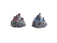
I wanted to make these two crystals of some sort but I don't think they work. I wanted to do a "weak crystal energy near the edges" and have them fade into more normal grey rockwork but clearly I didn't. I also wanted the left one to be more red than pink but once the magenta contrast paint went down, I just kinda went with it. The one on the right has the intended tone and while they aren't spectacular in any way, I still think they're cool.


These two are clearly bed mimics to go along with the beds we saw in week 37. Looking back at those old shots, I do not miss the old photo studio/settings/difficulties. I didn't spend as much time as I might have on these guys because I really don't think they'll get used. Then again, mimics. They follow the same basic scheme as the beds with additional effort on the teeth and maw. A sloppy mess of Reikland Flesh Gloss tries to sell the "this is a gaping maw of a malign creature trying to eat you" effect that is the essence of the mimic.


Next up we have a couple weird creepy mushroom things. I had higher intentions than I ended up painting these but where I was at that point, higher quality efforts really weren't in the cards. They're basically drybrushed over a contrast paint base coat which is probably obvious. In retrospect, I probably should have done more work since mushrooms do get a lot of screen time in my games and if I'm feeling ambitious at some point in the unforseeable future, I might punch these up some. 


This last shot is a big 'ol grabbag of things that didn't really have a good grouping. The creepy paintings are very weird and the ones on the left are pretty much phoned in. There's a lot of 3d-ness on these that might not be obvious but in some ways it made them easier to paint. Obviously I did more work on the ones on the right and I wanted to sell the "this is a cool painting with a demon coming out of it" vibe that it seems the sculptor was going for. The bottom left is a dude in a medical pod. I didn't do a lot of work on it and it shows. Ironically, the helmet and its missing twin got more love. Where's its twin? No idea! I dropped it on the floor after painting it and couldn't find it again. Gone forever. On the bottom right we have two ammunition packs (or something) flanking a marine having a really bad day. These didn't get a lot of effort, really, and I don't expect the marine to get much screen time.

2024 finished mini counter: 383/208

2024/12/01

Propapalooza week 17 (2024 week 48)

I'm ready to be done with props but there are at least a couple weeks go go but unlike a lot of the stuff that precedes, these guys were less phoned-in for various reasons.

First up we have a pair of neon signs in rubble. I painted them as if they were on despite being in a rubble pile because I thought that was more fun. The pop colors are mostly in Golden High Flow fluorescent because a) they really pop, and b) that just seemed appropriate. The pink and blue were adulterated with normal flat acrylics because I couldn't get a proper coat of the blue fluorescent and couldn't mix a convincing pink fluorescent out of the colors I have on hand. The rockery is drybrushed and washed as usual. Also of note, the signage is only visible from the front so the backs are comparatively really boring.

The two dudes on the left here are pumps of some kind so I painted them in a retro and dirtied-down red. Part of the red is played by Daler Rowney Inks through the airbrush and then washed down with various colors. I did some weak detail work and cleanup and lots of washes to get them where I wanted them. Notably, the first layer of wash over the metallics re-activated some of them but I'm way too lazy to go back and fix them after the fact. The two little guys I think are supposed to be crypts or something and despite being small, I did quite a lot of work on them. It started with a slap chop with washes and Contrast Paints followed by another drybrush. I picked out the metallic details and finished with another wash. I think they look good for the small investment in them. 

These next two are clearly bookshelves but are they really dumb mimics? No idea why they have eyeballs on them. I like that they're whimsical and did minimal work to pick out the books and potions and whatnot on the shelves. These too started with a slapchop but I ended up painting over most of the non-wood bits anyway because I wasn't happy with them. Not sure if the red irises were appropriate but they are hard to miss.

Last up we have the try-hardest items in this set. I like the effect of gemstones but I don't super like painting them because they require careful blends and edge highlighting. These sat with rough highlights for a couple months but when I finally got around to painting them, They turned out pretty well. I'd tried to edge highlight the gemstones individually but never got a result I liked so ended up with an extremely light drybrush instead which I think looks pretty good. They're nicely dramatic on the table but unfortunately they also took a long time blending every single facet

2024 finished mini counter: 361/208


2024/11/24

Propapalooza week 16 (2024 week 47)

If you were expecting props, well, I've got good news! Looking back on it, I kind of regret pushing to get all of these done this year. On the other hand, they'll all be painted which is nice.

First up we have all of these weird robot cult idol statues. I interpreted them as being made of metal and did very minimal detail work on them. They were basecoated and metallic-ly zenithaled with the airbrush which sped everything up quite a lot. The heavy Badger Ghost Tint Oil Discharge wash ended the process. I've been thinning it down with airbrush flow improver which makes it a lot less gloopy.

Next up we have these two...er...legally distinct Daleks. I wasn't entirely sure which side the eyes were on so I painted them on opposite sides for the two of them. I put some effort in to the details on them but let's be honest: they're real messy. I've been trying to use my misbehaving Vallejo Metal Color Copper more but it's really gloopy and hard to apply. I've been thinning it also with airbrush flow improver which helps in its application but not in its opacity. Dunno if I got a bad bottle or what but it's been a fairly low point in the line which I otherwise really like. 

I'm not entirely sure what these guys are. Are they supposed to be legally distinct star gates or something? Decontamination portals that are tall enough to trip you? Some other kind of stationary scanning device? They are nicely stable and are kind of impressive looking but I haven't a clue what I might us them for. Also, they don't fit nicely on my prop trays so I have no idea how often I'll remember I have them.


These yellow guys are also a mystery to me. Yellow felt right but wasn't based on any inherent logic. Because I didn't really know what they were, I didn't pick out super many details in different colors. Are they pumps? I legitimately don't know what they're supposed to be and I'm too lazy to go look it up. A lot of the props in this collection are like these: interesting but very confusing.

2024 finished mini counter: 351/208


2024/11/17

Propapalooza week 15 (2024 week 46)

Back to props this week and the end is in sight. Well, it is for me since I've basically finished painting all of them but they'll be pushed out here in increasing velocity as we close out the year. Also! perusing the photos below, you might note a change. I've swapped the old charcoal grey low-contrast background for a brand new kind of shiny white one and I've started really learning how to use my camera after, I dunno, more than a decade of not doing that. I'm already a lot happier with the photos that are coming out of it and hope that I'll be able to dial it in more in the coming years.

First up we have two large map display things. I imagine this as a situation room kind of deal, like where the villain mastermind is giving his soliloquy over a map of the world. I wanted the desks to be kind of dingy because I imagined these as old tech and painted some texture on the displays with, er, paint. They look better in person, IMO, but I don't know when they'll ever be used. Also, they're woefully unbalanced and don't like to stand up.

Next up we have a couple pairs of additional computer terminals. I had delusions of grandeur where I was going to paint in a bunch of details on the screens but ended up not doing any of that (obviously). I also grunged these down like the map display things. Also, I added the two DnL cola bottles and then didn't really paint them. A lot of these guys were really hard to magnetize so many of them aren't. I'm going to not be happy with so I expect to be rage-gluing magnets to the bottom of these at some point.

I interpret the two guys on the left as old-school terminal-y guys and painted them thusly. Like a lot of these guys, they were badly base-coated  with the airbrush, grunged down, and then badly detailed with brushes. The guys on the right are clearly globe displays and I figured they wanted to be holographic. The heavy-duty hydraulic tables they're on? I wasn't so sure on why they're necessary. I glued the globe-y guys to bases to make them more easily magnetized but I really don't know what the intent was. I probably could have done something with the seam in the terminal-y guys but clearly didn't.

These would be a pair of (seemingly) atomic-age TVs with weird wheeled feet. I'm immediately reminded of 70s era TVs and TV trays though I've never seen one with the atomic whirl on the top but I'm not well versed in these things. I did the same scan line thing on the screens that I did with the large map display things but ultimately I don't think they look particularly good. Then again, I have no idea if/when I'd ever use them so there's that.


Last up we have a pair of vending machines. Here too I had delusions of grandeur of painting the product behind the glass and/or some kind of corporate logo but clearly I didn't do so. I do like these and we do occasionally have Fizzy-Cheese or Space Coffee (TM) in play so out of the group of these, they're the most likely to get screen time but then again, we're good for maybe a couple sessions of Sci-Fi in a year.

2024 finished mini counter: 339/208


2024/11/10

A thing a week 2024, week 45

And now for something completely different.

This is a medieval tower-themed dice roller. It's built out of my typical XPS foam bricks and built around a chipboard/cardboard/old pringles can core. It's not particularly fancy but you can tell that the brick work was pretty shoddy, kind of on purpose, but it kind of got out of hand. I spent extra time weathering it and going up and down the color scale and even spent time putting joint compound between the brick cracks in the hopes that it would look more authentic with light mortar than the usually darker "hit the thing with a wash" look which completely got painted over. Overall it sells OK on the tabletop and is a functional dice roller but if I had it to do again, I'd do a few things differently. It took something like ten hours all told and it will count as my one structure for the year. Next week we return to Propapalooza and maybe just maybe some better photographs.


2024/11/03

Propapalooza, week 14 (2024 week 44)

Surprise! More props this week. I guess that's not a surprise. Anyway.

First up we have some perfectly normal hatches, grates, and ammo bins. These have a tiny bit more detail than a lot of the items in the last few weeks and thus they probably look a little more striking. I did slightly more with the grates than I might have because I thought they'd look better weathered a bit, hence the rust. The ammo bins have a green wash over the top that I don't think sells super well. Overall, they all still read reasonably and I'm not unhappy with them.


Next up we have a pair of emplaced guns. These make a lot more sense than some of the other turret-y looking bits (lookin' at you, weird walking turret guys from last week). I chose a military green-ish tone that ended up skewing a little too cool mostly because I had a too-thin mix in the airbrush when I basecoated them. I also took extra time putting some heat bloom on the barrel which sells better in person than in my lousy shots here (some day). Also of note, Vince always says you should drill barrels and I'm starting to get that. These look wrong without it but I am far too lazy to go back and drill them now.

Next up we have to very large props which are (hopefully) clearly bridges. There's a whole set of fantasy bridges to come but these are all sci-fi-ified. I didn't look closely enough at the details to see which ones might have been better picked out but I wanted them for a near-term session and rushed the last few steps. These are somewhat zenithaled in their metallics from the airbrush as part of a large batch and they look pretty striking on the table. And if you're wondering, they did get screen time.

Last up we have a...well...I have no idea what this is. It's clearly pretty Geiger-esque but I can only guess as to what it is. It's got a pretty obvious booby-looking structure at the bottom but it's mirrored on the other side which is clearly not boob-like. So, I have no idea what to do with it or if it'll ever get screen time. What I can say is that it's painted and it'll count toward the total.

2024 finished mini counter: 325/208


2024/10/27

Propapalooza, week 13 (2024 week 43)

I swear we aren't finishing the year with props and now we're getting into the weird sci-fi props.

First up we have two legally distinct Pal Boxes (TM) and three...er...transporter pads? I have no idea what these are supposed to be. Maybe circular hatch covers? With no handles? These are pretty clearly boring metallics with a wash slapped on them but since I don't know that I'll ever use them (doubly bad for the Pal Boxes TM since they're not even magnetized) I didn't spend a lot of time on them. Clearly.

These are a pair of scale-model red rockets and what I can assume are less scale-model and more full-of-fissile-material atomic bomb looking devices. The red wash on the rockets doesn't really show and the dark wash on the bombs really just served to grunge them up inappropriately. Not sure if/when any of them will ever see screen time but they're the best color: painted.


Last up we have...things. The robot arm is sensical enough. The turret with bizarre legs? No clue. The turret-y thing with legs also no clue. They feel a little abstract IMO so I didn't spend a lot of time thinking about how to use them and also didn't spend a lot of time painting them.

2024 finished mini counter: 312/208


2024/10/20

Propapalooza week 12 (2024 week 42)

 More props this week and probably for several weeks to come. 

These are barrels, the kind you'd see in your favorite vintage first person shooter. In my games they're either filled with gooey food-like goodness and/or they explode when shot. I could have spent more time weathering the dented barrels but clearly didn't. And, no, the two DnL Cola bottles weren't molded there--I glued them in for funsies. 


The two on the right are safes and the two on the left are satellites or comms relays or something. The guy in the middle is a...chest? Trunk? I dunno. I'm not sold on all the metallics to be honest but it did make them easier to paint so I got that goin' for me. The safes and trunk (or whatever) will probably get some screen time. PCs love to break into/carry off/blow up safes. The other bits...not so sure.


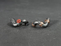
These last two are a mess. They're pipe segments but unless I really want to glue them down somewhere, there's no way they're ever standing up straight on a table. I suppose I could have used them as greebly bits on a diorama or something but I don't have one of those handy.


2024 finished mini counter: 300/208

2024/10/13

Propapalooza week 11 (2024 week 41)

This week we have dungeon tiles, still from Dungeons and Lasers, but like last year's dungeons tiles, don't count toward a fig count. I don't know why I decided that but I'm not getting points for not being consistent. No points for being consistent, either, so I got that goin' for me.

First up we  have a small number of these concrete-y tiles and I super wish I had more of these. I spent more time than normal on these to sell the texture and I think they came out well. The shot has a bunch of tiles behind there but in actuality I've only got a few of them. The ones behind them? Other tiles that didn't get pictures and I'm far too lazy to go back and take pictures of them. They're cool but not as cool as these concrete ones.

Next up we have these weird Geiger-esque guys that I also only have a few of. I base coated them in Golden High Flow black, mine of which is very glossy and otherwise doesn't get a lot of use. I did a light grey drybrush over them which sells better in person than it does in this super low angle shot. No clue if/when I might use them but they're painted now which vastly improves their chances of screen time.

The vast majority of this batch are these deck plate-y kinds of tiles. I certainly could have picked out more of the details but a) they're terrain, and b) doing so would be a very large investment given how many of them there are. The shot doesn't show it, but they're already a multi-step paint job starting with a dark Vallejo Metal Color basecoat followed by a wash, a drybrush, another wash and another couple drybrush layers. I keep an ancient pot of otherwise lousy Reaper Master Paint metallic for exactly this purpose. It smells funny and might be molding.


2024/10/06

Propapalooza week 10 (2024 week 40)

More props this week and probably for a while yet. 

First up we have a coupla bear traps. That's it, just bear traps. I could have grunged them up with rust and dirt and whatnot given a) where they live, and b) what they do, but clearly I didn't. I suspect these will get quite a lot of game time.


Next up we have a couple of bone-y thrones. These had some godawful mold lines as one might expect and were in several different parts. I pseudo-handled them and spent more than the normal amount of time staining the bone parts but I forgot to vary the horns in black or whatever. I'm not sure if the flame bas-relief was intended to be painted but I chose not to and not just because I'm lazy.


Last up we have a chest and a skull candle because what arcane table doesn't have one? The chest is a dupe of one I painted way back in Week 49 of 2022 which feels like a lifetime ago. This one came out significantly better but mostly because I used a better metallic. The skull got the same treatment as the bones on the thrones since they were painted at the same time.

2024 finished mini counter: 287/208

2024/09/29

Propapalooza week 9 (2024 week 39)

This week we're back to props. Most of these were painted a couple months ago to make space for my Lego endeavors so my memory is a little foggy on the details I'd wanted to note. I can say that they're mostly if not entirely speed paints and it probably shows.

First up we have two armor racks and a weapon rack. I stuck the weapon rack on one of my bases which was like 1000x easier to work with. I also realize that the camera angle I chose doesn't show the flagstone freehand I did on the base which is the best thing about it. The two armor racks were mostly painted with the airbrush and have a metallic zenithal because why wouldn't I?  These look pretty good on the table top but not in up-close shots.


Next up we have water hazards played by two metal fountains and two stone fountains. The metal fountains I painted in copper because that seemed right and I don't use that color super often. The stone basins are the typical grey wash/drybrush jobbie that I usually use. In both cases, one has blue water and one has red water in case I ever have to tell them apart for a puzzle or different effects or whatnot. More to the point, I find that when I do paint them in different colors, I find puzzles and whatnot to use them for. Function following form?! Seems weird IMO.


Last up we have whetstones, anvils, and chopping stumps. All three of them use a different contrast paint basecoat which you might think I chose for this shot, but really, it was the luck of the draw. The whetstone pedals are awfully spindly which really hampered my ability to drybrush them. IMO the leather tying down the anvils should have been painted in a different basecoat or otherwise differentiated in any way whatsoever but speedpaint. Similarly, the metal bands around the axe stumps should have gotten a wash or something to not look quite so shiny-new but also didn't. Ultimately, they're painted and that's what counts.

2024 finished mini counter: 281/208


2024/09/22

A Brief Sci-Fi Interlude (2024 week 38)

And now for something completely different. Earlier this year I ran a couple sci-fi one shots as many folks were unavailable. That meant that I needed a new set of PCs and since the 3d printer was fired up, I took the opportunity to beef up my sci-fi bads roster. 

First up we have Dixie Duvall played by a Space Cowgirl from Zierzo Miniatura. If you're in need of Texas Ranger themed space marines, Zierzo's got you covered. Of the characters in this round-up this one took the most time. There are a lot of very soft details like the star on her hat and what not and her face was really difficult given the brim of her hat. I could have painted her in subassemblies but I was in a hurry and didn't do that. I'm not sold on the color scheme I chose but it worked out OK at the table. The freehand on the box is an in-universe joke.

Next up we have Derek Thorp played by Future Savior from Papsikels, rapidly becoming a go-to for sci-fi figs. Papsikels does a lot of legally-distinct homages to pop culture characters and I especially appreciate how he names them. This guy is painted to match his concept art and the player's assertion that "the only thing I know is that he has a shotgun." The character didn't end up with a shotgun, naturally. I specifically used Golden High Flow Acrylic Black on his coat since it's glossy and I could have spent a lot more time selling the leather and denim but clearly I didn't. You can see a bunch of fun printing defects on his back.

Keeping with Papsikels sculpts, we have Space Captain who was supposed to represent a character for a player who ended up not making it but was a good stand-in for one "Maple" Mac Gilleasbuig, a player who unexpectedly showed up. This guy has a surprising number of details and I super don't like all the folds on his coat. For a speed paint, they're far too hard to pick out and as a result I kind of phoned this one in. The contrast paint basecoat on his jeans is still pretty glossy (similarly on Derek's) which bothers me but not enough to hit it with a dullcoat after the fact.

The baddies were well-represented by these (many) Vanguard Droids by Hivemind Minis. This sculpt has the superpower of being a free download and pre-supported which is basically my catnip. These are better sculpts than my paint job shows, again, mostly because I was in a hurry. Turned out it didn't matter since several of us got sick the week we were supposed to play our first episode. I also glued their heads on backward the first time so had the fun of snapping them back off and re-gluing them. Also, if you see any weird graininess on them, that's less of the printing defects and more of using the trusty baking soda + cyanoacrylate trick to a) bond faster, and b) bond more strongly. One might wonder why I didn't do the same thing to texture their bases. I've wondered that, too!

Last up we have Bios Equalizer Bots from Hexy Studios and they are also a free download. Like the Vanguard Droids, these are also better sculpts than my paint job shows. All of these bots were primarily painted with the airbrush using the ever-wonderful Vallejo Metal Colors--accept no substitutes! The details were random colors that I already had on my palette which is why they're so muted (again: in a hurry). They're super back-heavy because I was extra-lazy and didn't prop up their feet like I'd planned to after deciding not to print their custom bases. Some day I'll learn.

2024 finished mini counter: 268/208


2024/09/15

Propapalooza, week 8 (2024 week 37)

We're right around the middle of the props in this mega theme which is otherwise absolutely pumping my finished mini counter. I'm not going to feel guilty in any way about this--they needed paint! Today we have "things at an inn & tavern" and for reasons I don't fully understand, this one didn't publish despite being set so we have done so from the future!

First up we have four beds. Spoiler: there may be mimic version of these in the future. They're drybrushed, contrast-painted, and have very minimal drybrushing for highlights. The only really interesting thing going on here is the floors they're glued to. These are played by magnet stickers stuck to coffee sticks that were painted prior to glueing. There's a lousy curl on the magnet sticker that I couldn't 100% fix. 

These four are gooseneck stills. I was somewhat surprised to find that there were only two nozzles available across the four stills. I don't remember the sprues being different. Also possible I just plain missed them. The ones with the spigots were five (!) pieces! I stuck them to bases because they were slightly bigger than the magnets that I would have otherwise glued them to. And yes, they really did (do?) make stills out of copper. 


These two are hopefully obviously casks of some sort and I'm going to say that they're Dwarven casks since they have beardy runes on one side.These were also in far too many pieces and they were glued to the same magnet stickers as the beds. Like a lot of these, they're simply painted and look IMO, pretty good--high drama, low effort.


These guys are only arguably tavern-y things but I wasn't sure where else to put them. We've got two scroll piles, two book piles, and two taxidermied lectern beasts. Those poor, sad lectern beasts. The books are probably the ones I'm least happy with since I did almost no work on them. The yellow is pretty clearly a speed paint while the others are pretty clearly not. Overall they look painted. The lecterns sucked up the most time since they have the most details. Luckly the sculptor left some indented lettering so I didn't have to freehand that in.


2024 finished mini counter: 255/208